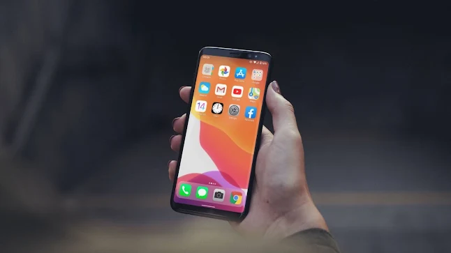
Let's be honest. Even if you're a die-hard android fan, you'd always wanna try out iOS. But, to do that, you should probably buy a new or used iPhone. Buying an expensive phone just for trying is just Berserk.
But, what if I told you that you can get the iOS experience without having
to buy a new iPhone. Yes, you can get the iOS experience without having to
change your device.

Disclaimer
Note that the experience isn't very exact. Your phone may become slow, There are still quite a lot of things that cannot be replicated until and unless you buy a new iPhone or maybe borrow it from someone.
However, there are many other apps but I love this.
But for most of the part, it works really good and the experience is quite flexible and customisable.
Parts of Operating System (From my stock Android post)
Before getting our hands dirty, let's look at the pages of an Operating System, design wise. Why do we need this? You can
yourself customise your device better if you knew what to customise in
your phone.
Mind you these are not design principles, rather a simple way to
understand screens.
These are the 5 Parts:
- Home Launcher (That includes the home screen and app drawer)
- Quick Settings (Notification Panel)
- Lock Screen
-
Application Window
The overall look and feel is controlled by these components. Note
that font, font size, spacing, text formatting, icons
and etcetera are included in these. These are the 5 basic tabs or pages
not components. This is not design rules, just my simple principle
that I use to make personalisation much easier.
However, we can't customise everything, like the Application
windows. It depends on the app.
Unlike the last time, where I had to use multiple apps to
personalise each tab, this time we've got an allrounder. The feel is
good, it tries to be convincingly iOS even the status bar is cool
but it's right not there.
If you want to get the stock android experience on any android
phone, you can check out this post
where I've explained everything the right way.
Let's consider the fact that this is just a launcher and nothing
else. For that, I would have to give it a 5 out of 5 rating. Super
cool.
The iOS Launcher
So there are various options in the market but they all need various
applications to personalise various tabs. But, the Launcher iOS 14 by SaSCorp Apps Studio combines all of those features seamlessly without any hassle.
I've personally tried other apps, but they are filled with way too
much ads and they take up a lot of space after installing all the
required apps. The other apps also make my phone warm but this
doesn't.
However there are a few turnarounds. The widget options are not quite
good. Even though other apps do not have this feature, I am not a huge
fan of widgets in this app.
The gestures are okay, not so amazing or snappy but that's good or at
least usable.
They nailed the status bar with the icons being truly convincing,
truly Apple. The Control Center is really nice with all features
retained near perfectly. But there's this one caveat that looks a
counterfeit-like. Maybe its just me but I hate it.
It's the icon wiggle. When you long press on an app icon, it starts
to wiggle, but all very uniform and in the same speed thus looks like
it's being faked. It's just these small caveats that makes app from
amazing to good.
The lock screen is quite convincing like other features, but there is
a caveat here too. You'd have to unlock your device twice. First, your
normal unlock, then the apple unlock. I've tried other apps and
there's the caveat on their apps too. It's not the developer's mistake
here.
But, one thing I can say is that the developer has put lot of
hardwork to make this app. From how convincing it looks to how
seamless the experience is.
Final Verdict
The experience is good, I'd say the least. If you're an iPhone lover
but don't want to or don't have the money to purchase it, then this is
the perfect app for you. Download and enjoy. You can thank me
later.
Tags:
Personalisation
